A Spike in Comments Is Not Automatically a Win
A case study leads with a big percentage increase in comments, and the chart under it goes up. Believe the chart. It still tells you nothing about whether those commenters liked what they were commenting on, and the piece counts on you to assume they did.
A rising line has no axis for tone
Comment count, share count, and reply count are volume metrics. They record that somebody acted, not what they said while acting. “Best thing I have seen all year” and “delete this” are, to the counter, the same event.
A wave of compliments and a wave of complaints therefore push the same number up the same axis. There is no second axis for valence, because the metric was never built to carry one. Be fair about where that starts: a platform’s native export hands over a count per day and no column labelled positive, negative, neutral, so the omission usually begins upstream of the case study. That explains the gap without filling it.
A hypothetical example: the same chart, two different weeks
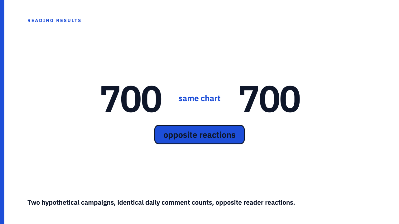
What follows is a hypothetical with invented, round numbers, not a description of any real agency’s reported result. Picture two campaigns from one hypothetical agency, five days each, tracked on daily comment volume.
| Day | Campaign A (hypothetical) | Campaign B (hypothetical) |
|---|---|---|
| 1 | 40 | 40 |
| 2 | 95 | 95 |
| 3 | 210 | 210 |
| 4 | 460 | 460 |
| 5 | 700 | 700 |
Identical lines: same start, same shape, same total of 1,505 comments. In this hypothetical, Campaign A’s comments were mostly compliments and approving reshares. Campaign B’s were mostly criticism, plus quote shares circulating a screenshot to mock the post. Opposite reactions, indistinguishable charts. A report showing only volume presents both as “engagement up,” which is equally true of either campaign and misleading about one.
What a sentiment check actually has to do
“Read the comments” is not a method. A sentiment claim becomes checkable when the case study states three things:
- A sampling method. A fixed number, say 100, pulled at random across the whole period rather than off the top of the thread. Top and pinned comments are whatever the ranking system or the account holder surfaced, the least representative slice available.
- A classification method. What counted as positive, negative, and neutral, and who applied those labels. A rough scheme stated plainly beats a bare assertion that the response was overwhelmingly positive.
- A check for a single triggering thread. Whether the spike traces back to one screenshot, quote post, or critical thread being passed around. A raw count cannot tell a broad organic reaction apart from thousands of people arriving through the same doorway, and those are different results wearing the same number.
Where the omission hides in a published case study
The tell is rarely a false sentiment claim. It is the absence of one. The page states a percentage increase in “engagement,” shows the chart, and carries no comment excerpts and no sentiment note. Nothing untrue is printed. The reader supplies the missing half.
The second pattern is a caption doing work the chart cannot. A bar or line chart stands as the entire evidence for “the campaign clearly resonated.” Strip the caption and the chart says only that activity rose. Hence read a results chart before you read its caption. It is kin to when the headline number is a vanity metric, with tone missing rather than the metric choice.
Keep this separate from a nearby question. Which base an engagement rate was divided by, followers or reach or impressions, is a definitional problem about what counts as engagement in the first place, and stating the formula resolves it. Sentiment does not resolve that way. A perfectly defined rate against a disclosed denominator still says nothing about whether the reaction was good.
Why a spike can be amplified without being liked
A widely repeated claim makes this worse: that distribution systems respond to engagement activity broadly, without weighing whether it was approving, which would let a post earn more reach on its way to being disliked. Treat that as unsourced. Nothing here ties it to any platform’s own published documentation on feed ranking, so it is a plausible pattern rather than documented behaviour, and a case study leaning on it as fact has not earned the point.
The consequence stands regardless. If a case study credits growth in reach or impressions over a period when comments also spiked, that reach number needs the same sentiment check.
Questions to ask before crediting a spike
- Was a random sample read across the whole period, or only the top and pinned comments?
- Does the piece state what share of the reaction was negative, or only that engagement rose?
- Could one identifiable post, screenshot, or thread account for the whole spike on its own?
- Would this chart have been published if the reaction had been hostile, or does it appear precisely because the outcome was already framed as a win?
Take it to a real one
Browse the case study library and read the engagement claims: how many state what was checked, and how many show a line and let you finish the sentence. If you have published one that states its sentiment method, submit your own.
FAQ
If a case study shows a spike in comments, does that prove people liked the post?
No. Praise and criticism increase the same counter by the same amount, so the chart cannot carry that claim. Before a spike counts as evidence of a positive reception, the piece has to state what was sampled, how it was labelled, and what the labels showed.
What would make an engagement-spike claim in a case study credible?
The three checks above: a random sample across the full period, a stated definition of positive, negative, and neutral and who applied it, and a check for whether one thread accounts for the whole spike. “Engagement rose” on its own does not make the sentiment claim its framing implies.
Is a comment spike ever safely assumed to be positive?
Context can make a hostile read unlikely. A giveaway or an unambiguous celebration post rarely draws a wave of anger. Even then the case study owes you a line on what was checked, because otherwise the assumption is the reader’s, not the agency’s finding.
Sources
- How to Read a Results Chart Before You Read the Caption, fetched 2026-09-07
- When the headline number is a vanity metric, ask what it hides, fetched 2026-09-07
- Engagement rate is three different metrics wearing one name, fetched 2026-09-07