Regression to the mean: why the bad quarter flatters the next
You are holding a case study whose before figure is the client’s worst quarter, the lowest month on record. How much of the recovery was going to happen without the new agency?
The before number was chosen for being unusual
A turnaround case study opens at a low point by construction: the before period is the one that made someone act, picked for being extreme, and that extremity is then offered as evidence of how much room there was to improve. Variation nobody controls throws occasional extremes with no change in underlying performance, so starting there makes part of the recovery arithmetic.
None of that is an accusation of dishonesty: the before figure can be accurate, disclosed and independently confirmed, and the problem holds. Nor is it the complaint about a missing baseline, covered in how to read a case study without being misled. Here the baseline is present, and its selection is the issue.
What regression to the mean claims, and what it does not
The mechanism is not ours. As the Wikipedia article on regression toward the mean has it, an extreme reading of a varying quantity tends to be followed by one nearer the average with no intervention, and crediting the intervening work is the classic error. It grows with noise and extremity, shrinks when the metric is stable and the dip shallow.
It explains a share of the movement, never all, and that share is unknowable from one before and after pair. Dismissing every recovery as regression is the same error reversed. A long steady decline is different: there the question is whether the decline would have continued, which is counterfactual, not arithmetic.
A hypothetical eight quarter series
Every figure below is invented, not any agency’s reported result. One hypothetical metric, qualified leads per quarter, engagement starting after quarter five.
| Quarter (hypothetical) | Qualified leads (hypothetical) | Status |
|---|---|---|
| Q1 | 420 | before |
| Q2 | 405 | before |
| Q3 | 440 | before |
| Q4 | 415 | before |
| Q5 | 268 | the trough |
| Q6 | 455 | work begins |
| Q7 | 468 | work |
| Q8 | 462 | work |
Caption: hypothetical figures only, invented to show two framings of one movement.
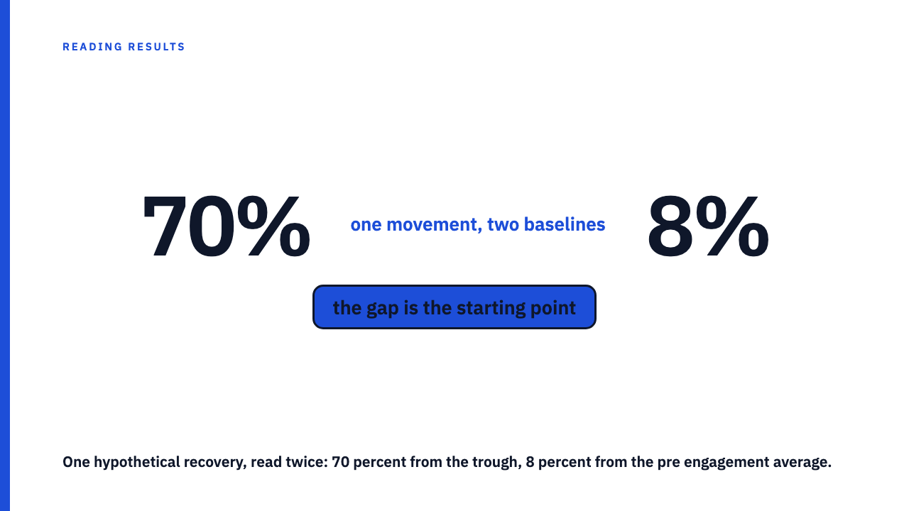
Trough 268 to 455 is about 70 percent. Against the 420 average of the four pre dip quarters, about 8 percent. The gap is what the starting point contributed, and a case study publishing only the first framing has stated it correctly.
Which metrics regress hardest
Noise is a bigger share of a small number, so a lift on a handful of conversions or leads is more exposed than the same lift on thousands, and a low trough is itself a small base, as in how the size of a percentage increase depends on its base. Metrics built from many small events sit in a narrow band; those dominated by a few large outcomes swing alone.
A single period window is most exposed, since a rolling figure averages away what one period exaggerates, and on a seasonal business the season supplies dip and recovery both. The after figure is selectable the same way.
What to ask when a case study names its worst quarter
- The same metric, same definition, for four to eight periods before the engagement.
- Where it sat in the series: the lowest reading, and how far below the pre engagement average?
- What happened in it: a stock outage, paused budget or locked account explains more than either cause.
- Whether the after figure is one period or an average, and how many periods it covers.
- Any untouched comparison: a channel, region or product line the engagement did not cover.
- The lift restated against the pre engagement average, not the trough.
What separates a lift you can trust from one you cannot
The strongest signal is durability: performance settling above the pre dip average and holding for several periods, since one rise above the trough is what regression predicts anyway. Next best is an untouched channel that went nowhere while the treated one rose, the logic of difference in differences.
Volunteering the full series, including quarters that shrink the lift, is informative about the agency reporting it. Broken accounts do get fixed and many recoveries are real work; this test exists so a real result survives a sceptical reader. It is about reading the claim, not running the engagement.
Writing the sceptical version of the number
Stated from the trough: leads up about 70 percent. Against the pre engagement average: about 8 percent, from a trough 36 percent below it. Both readings hypothetical.
One sentence, reusable:
The reported lift of X percent is measured from PERIOD, the lowest disclosed reading; against the average of the disclosed pre engagement periods it is Y percent.
From two numbers the result is unresolved, not false. Picking a period for being extreme is a selection effect, and the remedy is more series, as interrupted time series designs require.
Read a few in a row
The library holds 10 published case studies, each credited to the agency that reported them. Browse the case study library and try both framings, or submit your own.
FAQ
Does regression to the mean mean the reported lift is fake?
No. It accounts for some share of the movement, unknowable from one pair. The number is unresolved, not false, so ask for the series.
How many periods of history should a case study show?
Four to eight periods of the same metric on one definition, enough to show whether the baseline was the lowest reading and how far below the others’ average it sat.
What is the right baseline if not the worst quarter?
The average of several pre engagement periods on one definition, with the trough disclosed separately. A case study can state both, the lift from the low point and the lift from the average, and volunteering both is a good sign.
Does this apply to a long steady decline?
Less directly. A sustained decline has no single unusual period doing the work, so the concern shifts from the starting point to whether the decline would have continued. That is counterfactual, and an untouched comparison answers it better than a longer baseline.
Can the after figure be selected the same way?
Yes, and without anyone intending it. One unusually good period as the after figure stacks a second selection on the first. Check whether it is a single period or an average, and how long after the work began.
Sources
- Regression toward the mean, fetched 2026-08-28.
- Interrupted time series, fetched 2026-08-28.
- Difference in differences, fetched 2026-08-28.
- Selection bias, fetched 2026-08-28.