Two Measurement Tools, Two Numbers, One Case Study
You are reading a case study that reports a reach figure, and something nags. You have seen an account’s numbers in a platform dashboard and a separate analytics tool, and the two never quite matched. The case study quotes one of them, and does not say which.
The same word, two different measurements
Reach is not a measurement. Neither is engagement, and neither is views. Each is a label, and a label can sit on more than one counting rule. A platform’s dashboard reports its own definition, applied to its own event data, over a window it chose. An independent analytics tool reports a different definition, built on whatever data it can obtain.
So “the platform said 41,300” and “the tool said 48,000”, to borrow the invented figures below, can both be honest readings of the same activity. The two systems answer slightly different questions under the same word. It is the problem behind engagement rate can mean three different things, except that the competing definitions sit in two pieces of software, and only one made it into the case study. A write up that prints a single figure has picked a definition for you, deliberately or by default, and nothing tells you a second answer exists.
A hypothetical pair of numbers for the same post
The numbers below are hypothetical, invented for illustration, and must not be read as a real reported result belonging to any agency, platform, or published case study.
Picture a single post from a regional garden centre chain. The platform’s dashboard reports 41,300 accounts reached in the four weeks after it went up. An analytics tool connected to the same account reports 48,000, same post, same four weeks.
Nothing is broken. The platform, in this scenario, deduplicates across the whole period, so someone who saw the post on Tuesday and again on Sunday counts once. The tool records unique viewers per day and sums the daily figures, so that person contributes twice. The 6,700 gap is a deduplication boundary, not a discrepancy. Now imagine the write up leads with 48,000. Every word can be true, and the reader still cannot compare it to anything.
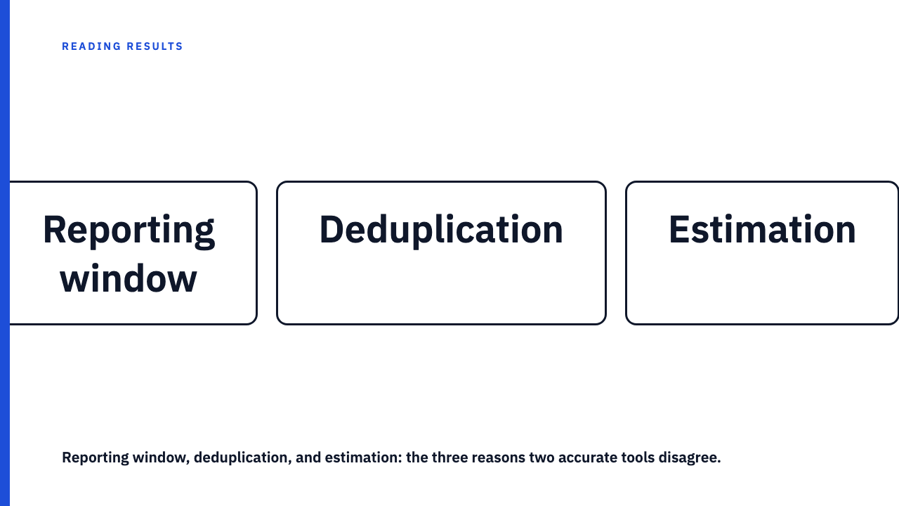
Three reasons two accurate tools disagree
The first is the reporting window. One tool counts activity as it arrives; another finalises a day only after a delay, backfilling late events into a period it already displayed. Pull both numbers on the same afternoon and you have not pulled the same window, even though the date range on both screens reads the same.
The second is deduplication, the mechanism above. Whenever a metric counts people rather than events, somebody has decided over what span a repeat stops being new: per day, per week, per campaign, per lifetime of the content. Four defensible rules, four totals from the same activity, and no tool double counting by its own definition.
The third is estimation. Not every quantity is counted exhaustively. Some are modelled, some sampled, some extrapolated from a subset. Two systems estimating the same true quantity in good faith, with different models, land on different figures.
None of this means a tool is lying or broken. The accurate word is “defined differently”, not “wrong”, and a reader who reaches for “one of these must be false” will ask the wrong follow up question.
What the case study format tends to leave out
Almost no case study names its measurement source. The number appears with a metric label and nothing else: no tool, no window, no definition. That is a convention of the format rather than evidence of concealment. Most authors never considered that the figure needed a provenance line, in the way that most people quoting a temperature do not name the thermometer.
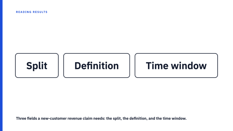
Keep the criticism precise. The problem is not that a number came from a dashboard rather than a third-party tool. Either source can be sound. The problem is that you cannot tell which one produced it, and so cannot tell whether the same result would look materially different from the other. An unattributed number is not a false one. It is an uncheckable one, and when a single flattering figure does all the persuasive work, remember that the best metric on a dashboard is rarely the whole story.
Questions to ask before you trust the number
- Which tool or dashboard produced this figure, and is it named anywhere, including a caption?
- Is the reporting window given as actual dates or as “last N days”, or only implied by the campaign timeline?
- Could a second source tracking the same metric plausibly show a materially different figure? For reach, unique visitors, and video views, usually yes.
- Is the metric defined, or used as if self-explanatory? Reach, engagement, views, and conversions each hide a choice.
- Does the document show its working, or ask you to take every figure on trust? Same test as asking what backs up a case study number.
Normal divergence versus a red flag
| What you are looking at | Ordinary methodology difference | Worth more scepticism |
|---|---|---|
| How the figure is presented | Source and window named, modest gap, stated mechanism | No source named, only the more favourable of two plausible readings shown, precision implied that the write up has not earned |
| Size of the gap | Consistent with a deduplication rule or a finalisation delay | Larger than any counting rule would produce, and unexplained. Worth asking about even without the second figure |
Read a few with this in mind
The habit gets easier with volume. This library holds 10 published case studies, each credited to the agency that produced it. Browse the case study library, or if you have published work of your own, submit your own and name your sources in it.
FAQ
Why don’t a platform’s dashboard and a third-party analytics tool ever match exactly?
Exact agreement is the exception, not the rule. The two can differ in when they close a reporting window, in the span over which a repeat viewer stops counting as new, and in whether a figure is counted or estimated. Any one of those separates the numbers, and disagreement alone says nothing about whether either tool works correctly.
Does it mean a case study is misleading if it only shows one tool’s number?
No, not automatically. Most case studies do not name their measurement source, which is a convention of the format rather than a sign of bad faith. Your job is to notice the omission and file the number as unverified rather than as false. The realistic ask is disclosure, naming the tool and the window, not publishing every competing figure.