A Google Trends Chart in a Case Study Is Not a Volume Chart
The evidence in the case study is a chart: a line climbing to a peak, an axis from 0 to 100, a caption crediting the campaign. It reads as a volume chart, where a taller line means more people. It is not one. That axis is an index, and its 100 was made by the chart, not measured by it.
What the 0 to 100 line is actually measuring
Google’s own training lesson on Trends data says: “Numbers on the graph don’t represent absolute search volume numbers, because the data is normalised and presented on a scale from 0-100, where each point on the graph is divided by the highest point, or 100.” The Trends FAQ adds that each point is divided by the total searches of its geography and time range.
So 100 is not a threshold a term crosses, it is the highest point inside the window and region the chart was built from. The same term can read 100 in a ninety day view and far lower in a five year view holding a bigger spike. The searching did not change. The denominator did.
The axis is therefore silent on two things: how many searches happened, and how this term compares to any other unless both sit on one chart. It is how to read a results chart before you read the caption, narrowed to one axis.
Two hypothetical campaigns, the same rising line
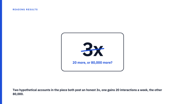
The following is invented, with placeholder terms and nothing from a real case study. Picture two campaigns, each with one phrase climbing from roughly 20 to 100 across a six week window. Term A is an everyday category phrase many people type every week regardless of advertising. Term B is coined, so narrow that a handful of searches in a quiet week is normal. Each chart is scaled to its own peak, so both show the same five fold climb, and Term B’s whole rise could sit in a band too small to move any business number.
Nothing separates them. Slope, height and top number are identical, so from the curve alone a reader cannot tell which of the two a real chart represents. Google’s FAQ makes a parallel point about places, where the same search interest does not mean the same total search volumes.
What else can move that line
The campaign is only one candidate explanation. A news cycle touching the keyword moves it, as does a viral moment unconnected to the brand, a competitor launching with overlapping wording, or an unrelated cultural event. Seasonality moves it too, in the years before anyone ran a campaign. And the geography setting decides which spikes register: a national view flattens one city’s surge, a tight region magnifies a small change.
Case studies rarely say whether any of this was checked before crediting the line to the campaign.
A short checklist before you trust the chart
- Is the exact query, date range and geography stated? Those three inputs built the axis; without them it cannot be read.
- Is the axis 0 to 100, or a real count? A 0 to 100 axis is a relative index, proving shape only. An axis in counted units, sessions, orders, signups, is a different chart.
- Is a disclosed outcome sitting beside it? If the chart is the only evidence, the case study is arguing attention and hoping you hear business.
- Does an external event overlap the spike? A category news story, a seasonal peak, a rival’s launch.
Comparison mode changes the rules, single term mode doesn’t
One reading does hold up. Plot several terms together and the normalisation applies to the graph as a whole: every point across every term is divided by the same highest point. That shared denominator makes comparison between those terms, on that chart, fair. Google’s lesson demonstrates it with two terms on one graph, one steady, the other barely registering until a spike. Its troubleshooting page adds the conditions: the same time range and location for each term.
None of that survives the jump between documents. Two single term charts in two case studies share no scale, window or region, because each was normalised to its own peak. Concluding from them that one campaign generated more interest is an arithmetic error, the same category mistake set out in someone else’s case study result is not your benchmark. This one slips past careful readers, because the axes always match.
When the chart earns its place in a case study
Used honestly, the chart answers one question: did interest move in the campaign’s window. Paired with a disclosed outcome number and a stated query, range and region, it is reasonable supporting context: it corroborates, it does not carry the claim, the same standard set out in a case study number is only as good as what backs it up. It does more than it can support the moment it stands in for reach, scale or business impact. This chart proves something moved. It never proves how much.
Check it against published work
Browse the case study library and check what each chart rests on, or submit your own.
FAQ
Does Google Trends show the actual number of searches for a keyword?
No, not through the interest over time chart. Google’s documentation states that the numbers do not represent absolute search volume: the data is normalised onto a 0 to 100 scale where each point is divided by the highest point. The score is relative to the peak inside the window and region you chose.
If two case studies show Google Trends charts with the same steep upward shape, does that mean their campaigns had similar reach?
No. Each chart is normalised to its own peak, so an identical shape says nothing about the volume underneath. That is the Term A and Term B problem above.
Is it ever valid to compare two terms on a Google Trends chart?
Yes, when both are plotted together in one comparison view, because then they share a single scale set by the highest point on the graph. Two separate single term charts cannot be compared.
What would make a Google Trends chart in a case study more trustworthy?
It sits beside a real disclosed outcome metric, states the query, date range and geography it was built from, and shows when interest moved rather than claiming a scale of impact.
Sources
- Google News Initiative, Google Trends: Understanding the data. Fetched 2026-09-07.
- Google Trends Help, FAQ about Google Trends data. Fetched 2026-09-07.
- Google Trends Help, Troubleshooting. Fetched 2026-09-07.